We may earn revenue from the products available on this page and participate in affiliate programs. Learn more ›
Since the late ‘80s, Adobe has been offering advanced photo editing software. The programs we use now look a lot different than they did back then. Adobe constantly updates its offerings with new features and apps. While we appreciate the constant stream of new editing toys to play with, the Adobe lineup has gotten somewhat convoluted. In an effort to serve legacy users and newbies, the company has ended up with a weird selection of options from which to choose. What’s the difference between Adobe Lightroom vs Lightroom Classic? The answer may not be immediately apparent. But don’t worry, we can help you break down the situation
- Best Adobe photo editor for most people: Lightroom CC
- Best Adobe photo editor for old school shooters: Lightroom Classic
- Best Adobe photo editor for mobile workflow: Lightroom Mobile
- Best Adobe photo editor for in-depth mobile editing: Photoshop Express
What is Adobe Lightroom?
Before we get into the nitty-gritty of separating Adobe’s individual offerings, let’s take a step back and look at the big picture. Way back in 2006, Adobe introduced a program called Photoshop Lightroom. Photoshop itself had grown into a massive goliath packed with awesome features that photographers just didn’t need when tearing through a memory card worth of images. Adding a fun bubble texture is an amusing thing to do when you’re slacking off at work, but it’s not useful for actual photo editing.
Lightroom has had a similar goal from the start: Manage your photography workflow. That includes importing and sorting your photos, editing, then exporting final versions. Apple’s Aperture offered similar features, which made editing large groups of photos much easier than slogging through Adobe Bridge to organize images and then importing them one at a time to Photoshop.
In Lightroom, you can edit one photograph from a whole set and then easily apply those settings to the rest of the collection. That can save a huge amount of time during a big edit, especially if you’re in a studio situation in which the lighting doesn’t change much. It’s a huge time saver.
The modern flavors of Lightroom aim to satisfy the same need. The tools, interface, and even the underlying architecture have changed considerably over the years, however. Adobe gradually added local adjustment options, improved profiles, preset compatibility, and hardware acceleration.
Adobe Lightroom vs Lightroom Classic split
In 2017, Adobe introduced a new version of Lightroom called Lightroom CC. It was much different than the previous version. Adobe built it for maximum synergy across different platforms. Lightroom CC ties tightly into the company’s Creative Cloud, which means you’d get a similar editing experience on a desktop, smartphone, or tablet. Adobe also took this opportunity to do away with perpetual licenses. You had to subscribe to Creative Cloud if you wanted Lightroom now.
In order to make it compatible across platforms, Adobe had to cut into Lightroom’s features and alter its interface. After all, the original Lightroom assumed you had access to a keyboard and mouse, which made cramped sliders and dense UI easy to navigate. That’s not true when you’re poking your finger onto a relatively tiny phone screen.
In order to keep its legacy users happy, Adobe kept the old version of Lightroom around but switched its name to Lightroom Classic. It’s technically called Lightroom Classic CC, but I have literally never heard or read anyone call it that.
What Adobe photo editor should you use?
Here’s where things get sort of interesting. The answer will differ depending on who you ask. To find the answer, you’ll have to weigh several aspects of your editing process. How much do you care about cross-platform compatibility? How much time have you spent getting used to the old interface? How inclined are you to go on Adobe’s support forums and get angry when the company slightly changes a setting that only a handful of people actually use? Let’s start the journey of self-discovery that will land you on the best Adobe photo editor.
Keeping it old school
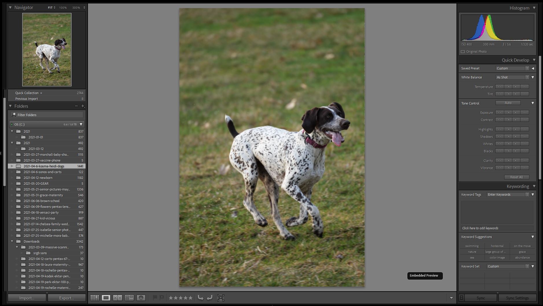
For seasoned Adobe users (including myself), the new Lightroom can’t compete with the dense feature-set you get from Lightroom Classic. We spent more than a decade working with these tools and they became automatic. Opening Lightroom Classic feels like stepping into an old pair of slippers if slippers could make your computer fans spin up louder than a space shuttle getting ready to take off.
Adobe has roped some of its cloud integration into Lightroom Classic, but it feels very limited. Cross-platform support is spotty. And even if the images you’re working on are easy to find in your library, you might find yourself frustrated when the iPad version lacks something you’re looking for like the advanced library functions.
If you have huge Lightroom catalogs, bringing them into the new software can be slightly stressful. Lightroom CC would prefer you keep all your stuff in the cloud so it can sling it out to any device you want to work on. Lightroom Classic can do that in some fashion with smart previews, but your catalog and archive ultimately belong on a PC (and your backups).
Best Adobe photo editor for old school shooters: Lightroom Classic
Stan Horaczek
Import your photos through the program’s interface to quickly sort and edit them. You can do some local adjustments (like healing blemishes) and other more niche tasks like making photo books. Classic also allows for easy compatibility with preset packs and third-party plug-ins that work through Adobe’s API.
Long live the new Lightroom CC Flesh
If you have no sentimental (or muscle memory) ties to the old Lightroom, you’re probably better off starting fresh with Lightroom CC. As stated above, Adobe built Lightroom CC with cross-platform editing at the front of mind. That kicked off the Adobe Lightroom vs Lightroom Classic battle that rages today.
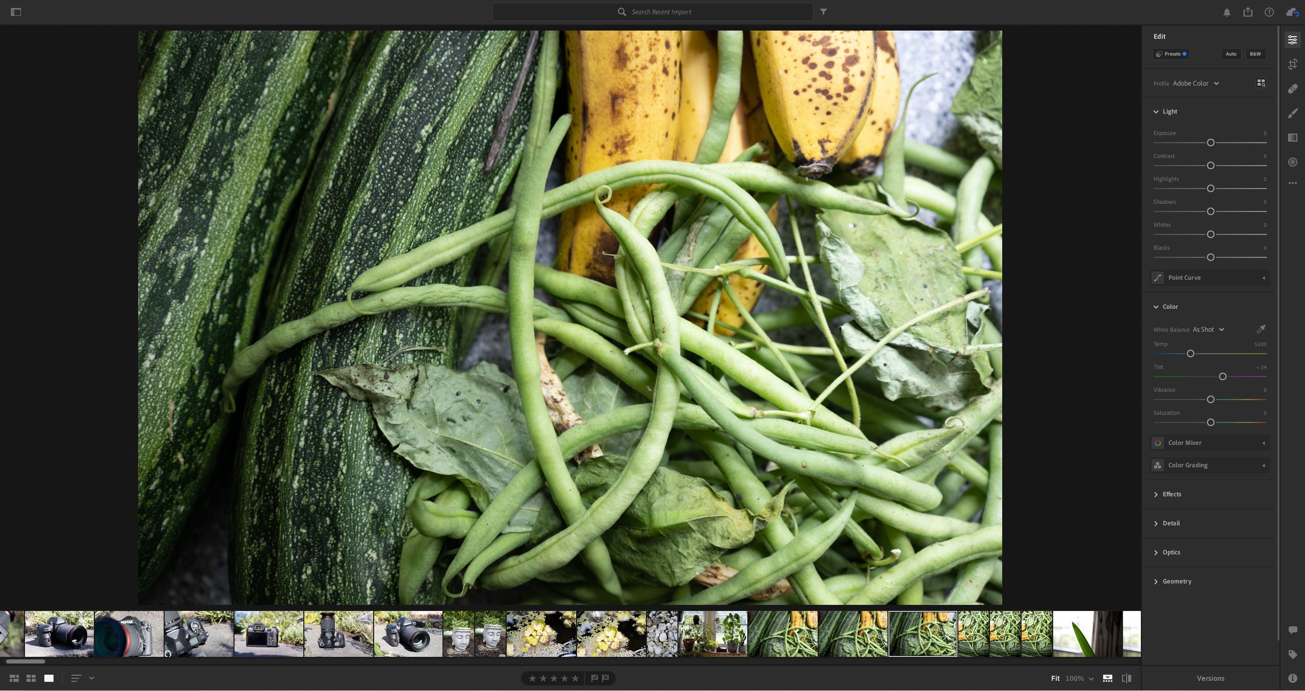
If you fire up Lightroom CC on your computer, it will offer an extremely similar experience to what you’d get on an iPad or smartphone. You get the same access to your entire catalog of images, and you can even sync your presets into the interface so they show up anywhere you have the program installed.
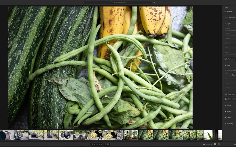
Lightroom CC offers a much more streamlined interface. You won’t find a dense stack of adjustments looming along the side of the UI like you will with Classic unless you go looking for it.
Old heads may not want to hear it, but the new Lightroom interface really does make a lot of sense once you get used to it. You can find almost everything you needed from the Classic platform and you can relearn the shortcuts.
Best Adobe photo editor for most people: Lightroom CC
Stan Horaczek
Born in 2017, this new version of Lightroom offers a streamlined UI that makes much more sense in terms of modern software. Catalog management makes all of your photos available in the cloud so you can step away from your computer and pick up your edit on a smartphone or tablet without missing a step. Because the software is newer overall, you may also discover that it’s just generally faster than Lightroom Classic for most tasks.
You get the same raw file support and camera compatibility as you would with Classic, which people often get wrong.
Going mobile
If you’re willing to make the leap into the current generation of Creative Cloud software, this is where you’ll notice a huge advantage. Interoperability between Adobe products really makes creative work simpler for people with multiple devices. That is, of course, assuming you can find your way through the companies confusing offerings. What the hell is Adobe Capture: Creative Kit? I don’t know.
If you’re looking for photo editing, however, you really only have two places you need to look.
Best Adobe photo editor for mobile workflow: Lightroom Mobile
Stan Horaczek
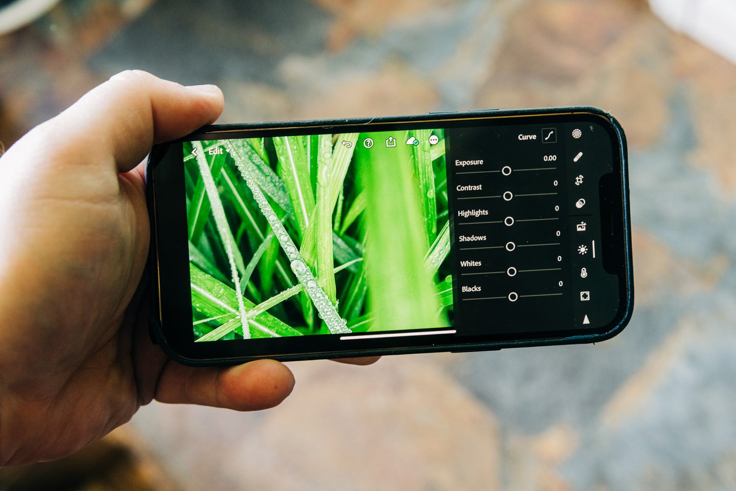
Open Lightroom on your mobile device and it will look familiar. You can only access all of the features if you have a Creative Cloud subscription (more on that in a moment), but you get basically the full Lightroom experience on iPads, smartphones, tablets, and anything else you can get installed on.
The app is available for iOS and Android. For some reason, it has slightly different names on each platform, which makes it extra confusing. What’s the difference between iOS’s “Adobe Lightroom: Photo Editor” and Android’s “Adobe Lightroom: Photo Editor & Pro camera?” Nothing.
Stay in your lane
If you’re planning on using Lightroom Mobile to any real extent, it’s best to use the desktop version that matches. It’s the best way to ensure that your presets work the same way and everything shows up as you’d expect it to in your library. I’ve used Lightroom Classic in conjunction with Lightroom Mobile and it’s clunky.
Lightroom Mobile also gives you access to the company’s built-in camera functionality. Now that smartphones offer raw photo capture, you can get an entire photography workflow out of your smartphone.
What the heck is Adobe Photoshop Express?
While we’ve been playing in the Lightroom Sandbox for the entirety of this guide, I want to take a minute to bring Photoshop Express into the mix.
There have been numerous interactions of mobile Photoshop through the years, but Photoshop Express shows off the advantages you get by upgrading off of the Lightroom Classic platform. Photoshop Express allows you to dig into more robust edits on your mobile device. If you’re on the Creative Cloud platform, your work is already in the cloud. You can just pull it up from your library and get to work on your phone or tablet.
This isn’t a competitor to the Lightroom software. It’s a companion. Don’t choose one or the other. Download both.
Best Adobe photo editor for in-depth mobile editing: Photoshop Express
Stan Horaczek
The desktop version of Photoshop is the best photo editor full stop, but Adobe’s mobile version has come a long way over the years. You can do one-click auto edits or use the AI-powered tools to dig deeper into your photos. It’s a surprisingly satisfying experience.
FAQs
Q: Which is better, Lightroom or Lightroom Classic?
Like most direct comparisons, this comes down to preference more than anything. Objectively speaking, however, Lightroom is built on newer architecture and has a much better grasp on Adobe’s overall Creative Cloud system so it’s probably the best place to start for someone coming in cold. The fight between Adobe Lightroom vs Lightroom Classic will rage on for a while.
Q: Is Lightroom CC the same as Lightroom Classic?
As good as Adobe is at making image editing software, it sucks at naming them. Lightroom CC refers to the new version of the software that debuted back in 2017. Lightroom Classic refers to the updated version of the previous software. Lightware Classic’s full name is technically Photoshop Lightroom Classic CC, but you will sound ridiculous if you call it that.
Q: How much is Adobe Lightroom?
Both versions of Lightroom reside in Adobe’s Creative Cloud subscription service. You don’t have to pay the $50+ for the whole suite of apps, however. The $10 monthly Creative Cloud Photography option offers Lightroom CC, Lightroom Classic, and Photoshop as well as some other features for just $10 per month. Some people still hate paying a subscription fee, but Lightroom used to cost $300 and Photoshop used to cost more than $700, so it still seems like a pretty good deal on our end.
A last word on Adobe Lightroom vs Lightroom Classic
If you’re bought into the Adobe ecosystem, you’re probably already using the $10 monthly Creative Cloud Photography subscription. That means you have access to all of the Lightroom and Photoshop products. The best way to decide is to give them all a fair shake. We recommend at leat trying out the revamped platform, even if it means re-learning processes you’ve been doing for a decade. I did. It involved an old man literally yelling at the cloud, but I now see the light.
