The 100 Best Album Cover Photos Ever: Help Us Update Our List
What's your favorite album cover photo? Which ones do you hate?
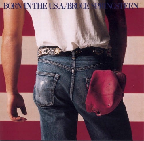
A few years ago, we here at Popular Photography put together a list of the best album cover photos of all time. It’s full of classics. But now, it’s starting to feel a little out of date and we want your input on what belongs on the list.
Determining what makes a “great” album cover photo is a tricky thing. It can be a spectacular photo, but if it doesn’t fit the tone and the attitude of the album, it’s a failure. The idea of an album cover in general has changed quite a bit since we’ve transitioned ever-more into the world of digital music.
So, take a look through the list and let us know what you think belongs on there. We’ll still be doing the majority of the legwork, but your opinion is important.
CLICK HERE TO LAUNCH THE GALLERY

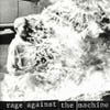
But Roe Etheridge’s photo of the artist’s bloody nose — reportedly obtained by self-flagellation with a cinder block and then the addition of pig’s blood — caused the album to get a big black-bar sticker in many retail stores. Fans bought it just to peel the bar off and see that bloody face. — JC
The images consist of stuffed bird specimens from the Department of Ornithology at the Australian Museum in Sydney, turned away from the camera and photographed against black seamless. While some have criticized the pun on the artist’s last name as a little obvious, we like to think the images were chosen for their unsettling mixture of scientific precision and unknowable mystery — a favored dichotomy in Bird’s music. — MJ
In a 2007 homage to the photographer for the Guardian, Hegarty described arriving in New York City in 1990, when much of the city’s art community had succumbed to AIDS-related illnesses — Hujar included. The melancholy of that era is palpable in this haunting image, as well as in the music. — MJ

“It was chosen almost at random,” recalled art director Robert Fisher. “The viewers could read into the cover whatever they wanted.” — JC
He found this image — a yellowed frame of two women leaning against a car by the obscure Russian photographer Sergey Chilikov — in a book, tore it out, and kept it taped to his wall while recording his debut album. “I always kind of felt like, ‘It’s got to sound like that. It’s got to sound the way that looks,'” he explained in a 2007 Pitchfork interview. Beirut’s second album, The Flying Club Cup, also took shape from a surreal and historic image. — MJ

The prototype for this style is our favorite; Tigermilk sported a barely blue-tinted image of a topless Joanne Kenney (now a promotions executive for SonyBMG) apparently breastfeeding a stuffed tiger (some say Tigger). The image spoofed a legendary banned ’70s cover with a suckling kitty, Mama Lion’s (see Preserve Wildlife in the Shocking & Censored Album Covers), but the music bore little resemblance. — MJ

The alien look fit her emotionally complex music.
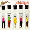
Trevor Key is credited with this cover image, inspired by the title track. “The cover was thought up by a design company in Covent Garden,” recalls founder and lead singer Poly Styrene. “I wasn’t very well at the photo shoot and I don’t really like my photo. The rest of the band looks great.” Aw, Poly, you look great too. — JH

On first glance, it looks like a Photoshop effort, especially given the white border around Bjork’s costume. But no, that’s actually the artist (looking remarkably normal) inside a bizarre sculpture by famous fashion designer Bernard Willhelm. Bjork wanted something colorful and upbeat. This photo and design by M/M — also meant to evoke pagan femininity — is just that. The white border? Because it’s a sticker, of course. — JH

Many people undoubtedly picked up the album because of its beguiling photo, aged and wrinkled, of an eerily faceless family on vacation. The image matches the duo’s slightly nostalgic sonic landscapes, layered with spoken-word tracks and ambient noise. — MJ
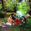
Nothing naughty is showing, but it raised eyebrows. Lwin’s mother tried to prevent the photo from being published, but Malcolm McLaren pushed it out on European releases. A different image was used for the US and UK releases of “See Jungle!” but this shot did appear on the group’s Last of the Mohicans EP in 1982. It was later used as an Anthology cover.


After a couple of glasses of wine with photographer Norman Seeff, she revealed that she was wearing lingerie underneath. Thankfully, she was also wearing leather boots. The pose, she says, was not meant to be suggestive. Rather, she was dancing when Seeff snapped. “I think it’s the containment that’s exciting about this particular picture,” she said. — DS


But in breaking away from her former band she masterfully commented on her own image of cool blond glamour with a cover image by famed Swiss artist H.R. Giger, best known for the dark, creepy sets he created for the movie Alien. With some computer work, Giger’s image literally punched holes in Harry’s icy facade. — DS
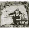
Though it starts with a photo of the duo (Amanda Palmer and Brian Viglione, as usual in white pancake makeup) at a seaside cafe table, invoking among other things the lost heyday of Coney Island, the finishing touches include rose buds and leaves pasted around the edges. — MJ
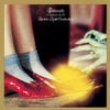
The band’s fourth LP was a concept album about dreams. And what is the most famous dream of all? That’s right — the one Dorothy had about Oz, witches, and ruby slippers. The album’s cover featured a pivotal still from the 1939 film. — DS
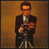
The rocker reportedly put on an Eagles album during the shoot. “I bloody hate them,” Costello said, “but I want to look in a really bad mood.”
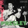
Presley’s debut LP for RCA was the first rock-and-roll album to reach #1 and heralded the King to much of the world. The cover featured a spirited photo by William S. “Popsie” Randolph and a wacky pink-and-green type treatment that’s been copied by the Clash (see London Calling in the Super 30 Album Covers), Tom Waits, and k.d. lang, among others. The King still rules. — JC

Combined, the interplay of words and image make a powerful statement on the role music plays in human sexuality and desire. Even if you’re not familiar with the cover art, odds are you remember the video for “Weapon of Choice” from this album, featuring Christopher Walken dancing up and down walls. — JMH
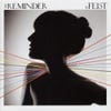
We’re mesmerized by the rainbow swash (or is that a nerve chart?) behind Mary Rozzi’s backlit silhouette shot of the artist, signifying her colorful singing and many-mooded songs.

No … it’s really those curious spheres hanging from Fleetwood’s belt. The album was a document of discord in the band’s couples: “Chris and John broke up, and Stevie and Lindsey broke up, and then I fell in love with Stevie, and it was a damn mess,” Fleetwood recently said. “If you could take a picture of that, you would have a genius shot.” This is as close as anyone came. — JC
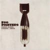
“The [combination] was, in many regards, an accident,” said designer Don Clark. “I had the half image of the torpedo placed on the cover and I wanted to juxtapose it with another object that traditionally wasn’t associated with war or violence. As I was scrolling through my folders of images, I happened upon the tube shot . . . and that was it!” — JC

The cover featured a surreal infrared photo of Miss Christine (Christine Frka), a member of the groupie-group the GTOs, who had been signed to Zappa’s label. The photo was by Andee Nathanson, the model’s roommate at the time. Miss Christine also happened to be the girlfriend of another Zappa cohort: Alice Cooper. — JH

Photographer Jean-Paul Goude hand-colored the photo with a bluish tint for effect. “Her image would suggest a strange menacing alien,” he later said, “when all I had wanted to do was sublimate her African roots.”

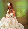
Model Dolores Erickson posed for photographer Jerry Whorf wearing a sheet slathered with shaving cream; she later said her pregnancy accented her pulchritude. “I thought, ‘Just another job,'” she recalled — but it was far from just another picture.
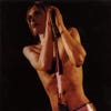
Mick Rock’s cover shot of Iggy Pop conveyed the mood: defiant, bizarre, stripped-down, and ready to burst. — JC

The cover shot by Christopher Whorf is all about Hayes’s bald head, what Whorf called “an in-your-face declaration of blackness.” — JH

The Onion called the album “simultaneously exciting and relaxing” — not unlike a comfortable overseas flight. (First class.) — JC

Bandleader and photographer Perry Ferrell dreamed up this image, created the twins out of plaster using his girlfriend as a model, and experimented with flames until he got his shot.

“Getting my hair cut is just a very special moment for me,” the Swedish bubblegum troubadour told The Onion. “I don’t know exactly why, but it’s such an intimate, almost religious experience.” With the clouds collaged in and the hand-tinting, the image also captures the guileless yet melancholy romanticism of the music. — MJ
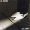
“When we came around the corner and saw this shaft of light I just pointed the camera down at Joe’s shoes,” Griffin recalled. “It was a rare and magical moment.” — JC
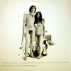
Then they posed in the nude, using a time-released shutter. Then they set out to release their noise montage as an album with the nude photos on front and back. All hell broke loose. A small run was released in Britain and the U.S. on obscure labels with brown paper covers, and thousands of these were confiscated as indecent. The artists said the title reflected that they were “two innocents, lost in a world gone mad.” — JC


She liked it enough to try to restage it with another photographer, with no luck. So she heavily retouched Shifrin’s image, adding a sci-fi visual to the album’s experimental vibe. — JC

But the weather on location in Northern Ireland was dreary, so a black-and-white image was colorized. Three children posed in various shots; the rocks hid the edges of the joined frames in a pre-Photoshop montage.

Nash Kato of Urge Overkill is credited with this picture (reportedly taken in a photo booth), which mirrors the raw sexuality and defiance found on the album. Phair recalls that Kato encouraged her to take off her shirt but leave the necklaces, put lipstick on her nipples (one of which is visible lower right), and get over her shyness. — JH
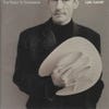
But Lyle also ponders the woes of love, having recently cycled through his whirlwind marriage with Julia Roberts. What we’re left with is a piercing gaze and crooked half-grin. — JC

His black-and-white vertical photo was cropped square and hand-tinted by designer Jeri Heiden. “It was like she was floating,” Heiden said of the result. “She took on the appearance of a marble statue, goddess-like.”
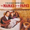
The list changed as hit tunes (including “California Dreaming”) were added, and later a black border completely surrounded the band’s faces, eliminating any visual evidence of the bathroom. — JC

Manson cemented his androgynous and freakish image with this portrait by Joseph Cultice, in which the nearly nude singer wore prosthetic breasts (the nipples were later retouched out), a plastic cup, and a coat of latex paint. Not to mention the sixth finger added onto his left hand.
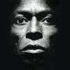
Though the album’s musical direction, utilizing synthesizers and electronic instruments, divided many fans, this striking and unconventional image lends Davis his deserved aura as an American institution. — JH
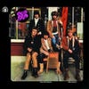
After the offending digit was discovered by the band’s label, Columbia, it was airbrushed out for subsequent pressings — until the 1973 re-release on the UK’s Edsel/Demon Records restored the photo to its original state. — JMH
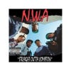
(This was actually the group’s second album, but the first was largely ignored.) Straight Outta Compton also introduced the general public to the genre of gangsta rap, though the group preferred to call it “reality rap.” — JH

How about a baby in a pool? Chasing…a dollar bill? With an underwater housing, photographer Kirk Weddle shot little Spencer Elden on his first swim — Elden’s dad held him but was removed from the image, and the dollar and fishhook were added.

Here, the cool innocence of Butch Belair’s portrait of an afro-coiffed toddler stands in sharp contrast to the title and content of of the album — and of course it has a strange poignancy given the rapper’s fate. The baby photo was put against a dark background for the posthumous re-mastered album, but it is the original cover that’s most striking. — JH
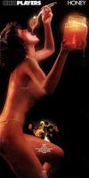
(A daft urban myth grew around the model and an audible scream in the band’s hit “Love Rollercoaster.”) Shot by Richard Fegley, the cover won a Grammy Award but got the album banned in many stores.

“We always dreamed of becoming successful together,” she recalled. This photo launched both careers — hers as the poetess of punk, unkempt but elegant; his as the artist who had the uncanny sense to pose her under a triangular stream of sunlight.

The album title doesn’t match the number of tunes (11) or band members (five) — but rather refers to the jersey number of basketball star Mookie Blaylock, whose name was used by the band until they were forced to change it to Pearl Jam (in honor of Eddie Vedder’s great-grandmother, Pearl). — JC
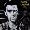
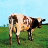
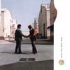
But the Hipgnogsis cover shot inside led many a stoned space-rocker to wonder: Is that real fire? It is, according to stuntman Ronnie Rondell (right), who wore a wig to save his scalp in the photo shoot.

This cover shot of a wet-hair-slinging Harvey by visual collaborator Maria Mochnacz certainly achieves that. The back cover was a closeup of Harvey with apparent rope burns. Nope, not your average female singer-songwriter. — JH
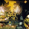
The line of foliage running down the middle of the set references a line from Prince’s song “The Cross”: “Ghettos to the left of us, flowers to the right.” — MJ
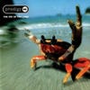
Designer Alex Jenkins thought a crab fit the title, as well as the band’s aggressive attitude. He found the photo, by Konrad Wothe-Silvestris, in an Images of Nature stock library. The background was given a zoom effect using Adobe Photoshop and a photocopier. — JC

Though Yorke had hoped to use an image of an iron lung for the cover, he apparently lost the picture. At the last minute, Donwood morphed Yorke’s visage with a photo he had made of a resuscitation dummy: “It had this strange mix of agony and ecstasy on its rubbery face,” he recalled. A perfect visual counterpart for The Bends.–JH
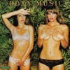
“We thought it would be nothing but a holiday snap,” recalled Evaline Seeling (left). “We shopped for sexy underwear.” Many stores banned the record; an alternate cover appeared with only the hedge.
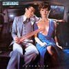
They first got in trouble with their absolutely tasteless cover for the German release of Virgin Killer, featuring a nude young girl, which was quickly replaced (we’ll steer clear of that one). They also caught heck for 1980’s Animal Magnetism. The Lovedrive cover, by famed design firm Hipgnosis, got the paper-wrap treatment on release and was also replaced, following complaints. “We weren’t in any way being demeaning to women,” insisted designer Aubrey Powell. “It’s just a weird picture,” he added of this bubblegum shot. “I don’t think it would have looked the same if it had been coming off an ear.” — JC

The shot — which McGinley used to promote his show I Know Where the Summer Goes — arrived in the e-mail inbox of singer Jon Por Birgisson just as the band was looking for a cover. — JC

The album marked a turning point in the bandleader’s career, a move away from his blues roots toward a more commercial, poppy sound. Rock photographer Norman Seeff created the image based on Miller’s many-faceted personality. — JH

The first models brought in — both young beauties — were vetoed by the band in favor of this more matronly waitress, dubbed “Libby,” hired from the Ugly Model Agency. — JC
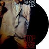
For the soundtrack LP, her shot graced a picture booklet that was shrink-wrapped around the black-and-white cover. — JC

Art director John Pasche added acetate and a feather to evoke a party noisemaker. “I was doing strange stuff,” said David-Tu, “and John let me get on with it and do my own thing.” — JC
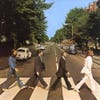
They gave photographer Iain McMillan about ten minutes. Most frames didn’t work — but one was perfectly symmetrical, except that McCartney was out of step and he’d shed his sandals (which led to lots of “Paul is Dead” hogwash). Fittingly, the guys are walking away from the studio (at left) rather than toward it. The shot capped a decade of brilliance.
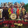
Why? It’s more about set design than photography — a meticulously composed montage, albeit a brilliant one. Designers Peter Blake and Jann Haworth and album mastermind Paul McCartney deserve most of the credit, but Michael Cooper captured it with his Sinar 4×5. And a splendid time was guaranteed for all. — JC
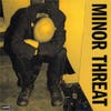
The cover of the first Minor Threat EP has been imitated time and time again by countless punk bands and even some major corporations like Nike.
The photo itself is nothing to write home about, but it’s quick-and-dirty approach fit the band’s aggressive sound perfectly. The cover was printed in a wide variety of colors, some of which are now worth thousands of dollars on the collector market.
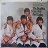
Yet the stateside versions of their albums were chopped into different song lists for commercial reasons, much to the musicians’ dismay. As a comment on the “butchering” of their “babies,” the Beatles posed for this outlandish shot (brainchild of photographer Robert Whitaker) with dismembered dolls and chunks of meat. On the album’s early, limited release, a public outcry indicated that this time the lads had gone too far. A pressing of 750,000 was recalled and many became collectors’ items, as did thousands of sleeves on which a bland replacement shot was pasted. (Resourceful collectors figured out how to steam off the new cover.) — JC

The image, taken by photographer James Baes, originally appeared in a 1976 U.S. Bicentennial issue of Hustler. Responding to public (or is that pubic?) complaints, the record company later put out an alternate cover that obscured the skin, showing only the flag-themed bikini cloth on a black background. — DS
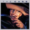
The 17-year-old Russian-born model, Natalya Medvedeva, later posed for Playboy, wrote poetry, sang in her own band, and died in 2003, but her young smile is immortal. — JC

The type treatment copied Elvis Presley’s first RCA album sleeve. “It was intended as a genuine homage,” said designer Ray Lowry, “to make plain the obvious sources of our insanities.”
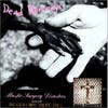
The DK singer’s moniker is meant to expose the hypocrisy of junk food affluence (Jell-O) with mass starvation (the short-lived African nation of Biafra). Mike Wells won Press Photo of The Year in 1980 for this image, called “Hands,” of a starving boy with a missionary in Uganda. The photo was entered in the competition without Wells’s consent by a publication that had sat on it for five months. Wells was not amused, being against profiting from the suffering of others. — JH

“We didn’t want anything psychedelic as we weren’t that kind of band,” said keyboardist Ray Manzarek. What Brodsky gave them was weirder, befitting the album’s darkly carnivalesque mood.
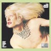
Winter pioneered the gender-bender cover with makeup and jewelry to accent his albinistic features. The image — which also evoked the 1910 film Frankenstein, name of the band’s monster hit — was out of character for both Winter and designer/photographer John Berg. But it sold millions.

Some time after its release, however, complaints poured in about the appearance of a (rather small) digit protruding below the waist of lead singer Rudy West (far left) — which turned out to be his right-hand index finger. The offending digit was airbrushed out for subsequent pressings and the originals became collectible. — JC
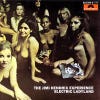
It was both praised and panned, but Hendrix hated the cover. His request to use a shot of the band by Linda Eastman (soon to be McCartney) had been ignored. The U.S. label, Reprise, put out a sleeve with a head shot of Hendrix, which later became the international CD cover — partly as a posthumous nod to the artist’s wishes, and partly due to the nude cover’s hoopla. — JC

The woman is not an authentic topless flamenco dancer either (if such things exist), but a friend of a friend of the band. At one time the album was to be called Gigantic, but the band feared unintended assumptions about how it related to the cover image . . . and Surfer Rosa was born. — MJ
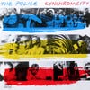
“For this record we have each been photographed separately, choosing our own images to illustrate our idea of synchronicity,” recalled guitarist Andy Summer in his memoir. “We won’t see one another’s pictures until the album is released, but it seems sadly symbolic of the inner life of the group.” Many of the images were shot by Duane Michals. Originally the album appeared in 36 variations, with different color and photo combinations, before one was standardized for CD. — JC
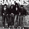
The graphic, gritty, no-nonsense cover shot perfectly fit the raw sound of the genre-busting album, which Spin later described as “Britzkrieg pop stripped down to its 1-2-3-4.”

After a lengthy battle with their label, Decca, over Barry Feinstein’s shot of a graffiti-laden toilet scene, the group finally gave in and put the album out with a plain white sleeve that mimicked a dinner invitation. (Unfortunately, the rival Beatles had put out their own White Album a month earlier.) But the darkly menacing mood of Banquet did come through in Feinstein’s interior shot of the band — and the toilet cover was restored when the CD came out in 1984. — JC

The model was Warhol Factory performer Joe Dallesandro. The band’s famous tongue logo debuted on back of the sleeve.
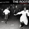
This one — of white police officers chasing black teenagers through Brooklyn’s Bedford-Stuyvesant neighborhood in the era of the Civil Rights Movement — is by far the most striking and perfectly fits the intelligent, socially-conscious ethos of the music (also embodied in the album titled, taken from Chinua Achebe’s archetypal African novel). — MJ

The still was taken from Andy Warhol’s 1968 film Flesh, which was called one of the year’s best films by Rolling Stone. The Smiths, and especially lead singer Morissey, became underground gay icons in their own right, and soon Rolling Stone would be lauding their music, not just their cover art. — MJ
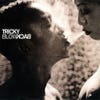
But it’s done with the subtlety and palpable light we’ve come to expect from music photographer Anton Corbijn, who’s shot covers for U2, REM, Bruce Springsteen, Depeche Mode, Metallica, and John Lee Hooker. The inside of the Blowback packaging contains a nice selection of outtakes from the Tricky shoot. — MJ
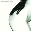
Could this be due to the cover art? The British (and international) version featured a naked behind and a gloved hand; the model was the girlfriend of photographer Colin Lane. “I walked out of the shower and I was completely naked,” she recalled. “I was walking around the house, and he was like, ‘Put this glove on.’ I walked over — boom, that was the shot.” But for the more prudish US market, a tamer (and less alluring) photo of particle collisions was put in place. — DS
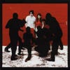
An inside photo reveals them to be paparazzi. The double edge of the duo’s fame was reflected in Patrick Pantano’s cover shot. “A lot of the lyrics are paranoid,” said Jack White of this album. “It does kind of match all these figures coming at us on the cover.”

But as they approached, one of the lads peed on a slab, and the others followed suit. They decided the shot fit their image.

Born of a stage collaboration between Waits, his wife Kathleen Brennan, and playwright Robert Wilson, this set blends exotic sounds with passionate songs; Matt Mahurin’s eerie image adds yet another dimension. — JC
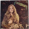
The cover was actually a foldout, with the naughty bits covered by a window until the viewer opened the front sleeve, but it was soon banned and altered by label execs. Carey, touted as a Janis Joplinesque singer, had previously bared all for Penthouse. The photo was parodied by, among others, Belle and Sebastian in their debut (see Tigermilk in the Stylishly Alternative Covers). — JC

Three years later, they put a more troubled-looking Rowen (photographed by Ian Findlay) on this record about the destruction and aftereffects of war. Rowen also appeared wearing a soldier’s helmet on U2’s The Best of 1980-1990. “It didn’t make any difference to my life,” said Rowen, now 32 and a photographer, “except it was a day off school.” — JC

Its mysterious air comes through the cover montage with a portrait by Joel Brodsky, best known for his work with the other Morrison (Jim) and the Doors. Never again would Van look so youthful — or sound so gorgeous. — JC

“I saw this freshly painted picket fence that went on forever,” Turner recalled. “Just a picket fence and brake lights: the suggestion of a road more than the road itself.” — JC
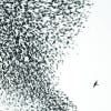
Yet 2007 was not the first big year for this distinctive photo of a flock of starlings being attacked by a peregrine falcon in Rome; in 2005 it beat out more than 17,000 entries to help Presti win the prestigious title of BBC Wildlife Photographer of the Year. — MJ
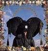
An avid environmentalist, Wallinger added elephant ears (made of plaster of Paris) to heighten the alarm, though the backdrop in Steve Wallace’s photo simulated a sunny blue sky. The frame — a zany pastiche of mementos and corporate clutter — had to be reprinted after some companies balked at the use of their trademarks. — JC

Produced by Ray Manzarek of the Doors, this acclaimed album paints a bleak portrait of X’s home city. Gargani’s cover mirrored the album’s ominous tone. — JH
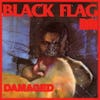
Many of Black Flag’s albums used illustrative art, but the gritty realness of the photo matches the unbridled intensity then-frontman Henry Rollins brought to this record.
By modern standards, it’s a very rough photo, but it perfectly matches the DIY ethics and angry attitude embodied by the music itself.
