How To: Experiment with Subtractive Lighting Using Glassware
With glass, focus on what not to light

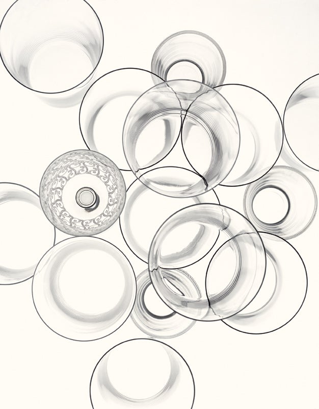
Glass is an intriguing subject for studio photographers because of its many visual qualities. It can be both highly transparent and highly reflective. It also can be photographed to reveal striking shape, color, and texture. In this instance, it was the repeated circular motif of the clear glassware that inspired the talented Kenji Aoki of Tokyo and New York.
His main goal for the shot? “I didn’t want it to look like an advertisement for glassware,” the photographer says. In fact, it’s rare for professional studio photographers to shoot glassware from above. They almost always shoot it straight on, often side-lighting it against black. “By shooting from above and lighting from below, I was able to capture the circular shapes of the glasses and make their geometry my subject. The result almost completely removes the glasses from a realistic context,” says Aoki.
His lighting, especially the subtractive lighting, was an essential tool in crafting the image. Following this classic technique for darkening reflections, Aoki paid just as much attention to what wasn’t lit on his set as to what was. (The caption on our setup illustration explains it in detail.)
One of his main challenges was producing a perfectly evenly lit background. To achieve this, before putting the stacked glasses into position, he divided the acrylic diffusion panel that would backlight the glasses into nine zones or sections and metered each separately. By adjusting the aim of six strobes pointed down at the white floor, he brought all nine segments to the exact same brightness to within a tenth of a stop.
Another unusual technique: Instead of the high contrast and crisp black-and-white often used to boldly highlight the line and shape of glassware, Aoki decided on an unusual, antique look by adding a faint sepia color to this otherwise monochromatic scene (shot on color film). He achieved this with an 81A amber filter over his lens. “The idea was to create an effect like a drawing that was made a long time ago, instead of a more crisp, modern, crystalline look,” Aoki explains.

Kris Holland/Mafic Studios
When we first saw Kenji Aoki’s image, we were convinced he had outlined the rims of the glassware with black ink to make their circular shapes pop so boldly. But, no. To get that black, Aoki prevented light from striking them using subtractive lighting techniques. He started by making sure the light behind the glassware was even from edge to edge: He used six Profoto strobe heads (A) beneath his set, powered by two Profoto generators (B). He bounced the strobes’ output off a white floor (C) and, to diffuse their output even more, suspended a sheet of translucent acrylic (D) on sawhorses beneath the glasses. Had he placed the glasses directly on this acrylic sheet, they would have been too strongly backlit, showing gray, not black, rims. Instead, he lifted his subjects off the acrylic sheet with a pane of glass (E) on wooden blocks (F), making the glasses’ edges go dark gray. Then by turning the room lights off, Aoki let the rims reflect the darkened ceiling above, turning them a shade of full-on black.
Aoki is a master of the minimalist approach to studio product photography. U.S. publications that use his work include GQ_,_ Wired_, and the_ New York Times.