How To: Make a Timeless Architecture Photo
For his evocative photo at New York’s Ground Zero, Jay Fine followed a few basic rules for shooting architecture

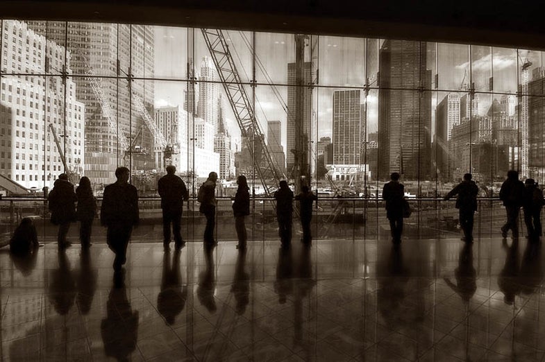
For his evocative photo of the building project at New York’s Ground Zero, as seen from inside the newly rebuilt Winter Garden in the neighboring World Financial Center, amateur photographer Jay Fine followed a few basic rules for shooting architecture:
Humanize bricks and mortar.
By juxtaposing the foreground silhouettes with the buildings beyond, Fine adds an important human element to his tableau.
Control horizontals and verticals.
To prevent lines from converging near the top of the distant buildings, Fine didn’t tip his DSLR; he positioned its sensor parallel to the buildings before him.
Compensate for lens distortion.
With a wide-angle lens to capture an entire building or site, linear distortion and bowed lines often become problems. To control them, Fine placed the prominent horizon line in the center of his image, where it was least likely to bow or bend.
Shoot with a polarizing filter.
Had Fine not used a polarizer for this shot, the fascinating reflections on the floor would have disappeared into a broad expanse of white glare, and the distinctive wisps of clouds would have blended into an equally white sky.
Follow Jay’s steps and you too can make breathtaking images of architecture:
Step 1
Follow the light. “I started by walking around the Winter Garden looking for a camera position that provided an interesting vantage point and interesting light,” says Fine. (With architecture, you need both.) “The composition I ultimately selected let me capture the beautiful buildings in a pure autumn light that shone through perfectly clean air—one reason why the picture is so sharp.”
Step 2
Experiment, then experiment some more. Fine’s first photos were not nearly as powerful as the one here. He worked the scene: “I bracketed exposures, changed the focal length of the lens, and repeatedly varied my position until I had my shot.”
Step 3
Be patient. When Fine finally found the viewing angle, background, and composition that spoke to him, he didn’t start shooting—he waited. “The challenge was to catch the moment as dozens of tourists and office workers formed a visually interesting pattern of silhouettes and reflections that were evenly distributed across the scene.”
Final Step
Finesse the image in postproduction. To help link new and old New York, Fine sepia-toned his image in Adobe Photoshop CS3, which gave added impact to the older buildings. To sharpen the image so it would appear like a classic 1930s shot made with an 8×10 sheet-film camera, he sharpened the file with a high-pass filter similar to the technique we described in Software Workshop in March 2010.
For more of Jay Fine’s photography, visit: Flickr.com/photos/jayfine.