How to Shoot Museum Quality Images
You don't need lots of training and an expensive apparatus to take great architectural shots. Just spend time finding the right angles.

Few types of photography are more specialized than shooting architecture. The pros use complex, large-format cameras with distortion-free and perspective-controlling lenses that cost thousands of dollars, and their careers usually start with years of apprenticeship to other pros.
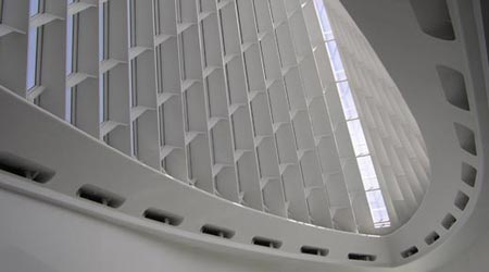
That said, however, the shot of Windhover Hall — part of the Quadracci Pavilion of the Milwaukee Art Museum, designed by Santiago Calatrava — has attracted numerous compliments since it first appeared on Flickr.com in September. And it was taken by me, a 54-year-old tax lawyer practicing in St. Louis, MO, who’s never had a lick of professional photo training, architectural or otherwise. What’s more, I didn’t shoot it with a swing-and-tilt 8×10 camera or even the latest DSLR. I used a simple digital point-and-shoot, the Olympus D-550 Zoom.
Did I just get lucky? No. I used the following old-fashioned photographic horse sense.
• Study the subject. I wandered around the Pavilion for a half-hour looking at the angles, curves, and lighting. I recommend that photographers take time composing such shots, consider the location, and take multiple pictures at different exposures and from a variety of vantage points. Do you want people in the shot to suggest scale? Or do you want to focus more on the abstract design of a building?
• Seek contrasting elements. Putting both light and dark areas in your shot, for example, can be visually stimulating. Here, I contrasted the curved or swooping lines at the bottom of the shot with the rigid, grid-like right angles of the windows above.
• Create a sense of depth by establishing clear fore- and backgrounds. This will lend the picture the appearance of three dimensions.
• Wait for the light. With architecture, time of day can be crucial. If the light is too contrasty, wait for an overcast day. I shot this in the bright light of midday. The strong side lighting served me well by exaggerating the façade’s ribbed detail. Light is obviously also important for exposure. This picture was made handheld (1/400 sec at f/3.2). I steadied the camera by leaning against a wall and holding my breath as I shot.
• Know your gear’s limitations. You must understand what your equipment can and can’t do. My Olympus D-550 is a digital point-and-shoot 3MP with an f/2.9 lens and a limited 2.8X optical zoom. [Pop Photo used Genuine Fractals Print Pro by onOne Software to make the image big enough to print across the magazine spread.] The lens is sharp, but like most lenses in compact cameras, its forte isn’t distortion control. So I would think twice before shooting grid-like architecture straight on. The lens could sink the shot by introducing barrel or pincushion distortion.
• Study your pictures. I originally didn’t edit the image, but after getting comments from Flickr viewers and really looking at it, I decided to crop the bottom edge to eliminate windows that detracted from the overall effect. A much stronger picture resulted.
• Shoot what you love. If this photo demonstrates anything, it’s that finding something fascinating is vital. Quadracci Pavilion is a breathtaking structure, beautiful from all angles, inside and out. I felt compelled to shoot as much as time permitted. By letting my passion for architecture in general and this building specifically play out, I was rewarded with a memorable image.
For more of Bill Falk’s work, visit www.flickr.com/photos/bill_in_stl.

image

image

image

image

image