Black and white portraits: A how to guide
Three pros provide tips for strong, expressive black and white portraits.


Photography’s best shooters often turn to black and white for its expressive power. We spoke with three pros to learn the intricacies of creating strong black and white portraits.
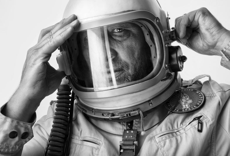
“For me, a person’s true essence is best communicated in black and white,” says portraitist Ima Mfon. While it’s true that most see in color, color can sometimes be too descriptive, adds the Lagos-based photographer. It can fail to show the depth and mood that black and white’s contrast, rich tonality, and shadowing can communicate. Monochrome can bring the focus powerfully upon the individual, while the distraction of color can pull it away.
Sandro Baebler, a portrait, editorial, and advertising pro based in Zurich and New York, prefers black and white for many reasons, but mostly for its timelessness. After all, the portraits we recognize as being “great” since the birth of photography are predominantly monochrome. “Also,” he says, “black and white conveys more about the qualities of light.” When the subject is well lit, “the interplay of light and shadow in black and white can create a more powerfully three-dimensional effect. Color, on the other hand, can lack dimension,” he adds.
It’s by no means a hard and fast rule, but black and white can also capture texture more convincingly. “Skin, whether youthful and smooth or aged and rough, as well as background details such as weathered buildings or textured rocks, usually respond well to black and white,” explains Mfon.
Melanie Dunea, an internationally known New York-based portraitist and editorial photographer, often prefers black and white for reportage and environmental portraits. Because of its association with newspapers, there’s something inherently newsy and topical about monochrome. ” I also like it for the consistency it brings to the environmental portraits made under lighting with a variety of color temperatures,” she explains.

SHOOTING STRATEGIES
Baebler shoots in RAW and keeps the full-color files “because you never know,” he says with a smile. Among other pluses, RAW files give him far more flexibility in fine-tuning skin tones during conversion.
When Baebler sets up his Canon EOS 5D Mark II for portraits, he often sets the LCD screen to preview his shots in black and white. This is especially useful for finessing his lighting because the monochrome preview can more readily reveal strengths and weaknesses of a particular lighting setup.
Since the rich tonality of a good black and white portrait is typically one of its strengths, Mfon has developed an eye for recognizing good highlights, shadows, and midtowns, and making sure they’re well-represented in many of his portraits. “Try for a balance of these three tonalities, otherwise your portraits may appear dull with too much grey or dark with too many blacks. Obviously, high-key and low-key renderings [as in his portraits here] can also work,” he says.
The process for achieving rich and luminous tonality, however, is different for every skin tone and every background. For artificially lit shots, he suggests adjusting the relative intensity of highlights and shadows (main versus fill lights).
Rich tonality can pop up in surprising places. Monochrome skies behind outdoor portrait subjects, for example. “You can get a lot of pictorial impact from a black and white sky,” says Mfon. Experiment at a different hour and, if you’re shooting film, with different colored filters threaded onto your lens, he advises. To add life to a monochrome sky with digital, try an adjustable circular polarizer.

RAW CONVERSION
The details of converting a full-color RAW file to monochrome are critical when shooting black and white portraits. Particularly in subjects who have lighter skin tones, says Sandro Baebler, one of the most important steps is adjusting the relative strengths of the reds and yellows. “Adjusting these two channels in concert can make huge differences in the way your subjects’ skin appears,” he says. It often works best to dial in a skin tone that separates your subject from the background.
For Baebler, conversion begins in Adobe Camera Raw. “I open them in ACR first in color, and try to do as few edits to contrast, color, and exposure as possible because they can affect the conversion. Then, in Photoshop, I convert them with a b&w adjustment layer. If a contrast or exposure move is required, I make it with adjustment layers on top of the conversation layer,” he explains.
Mfon prefers to use Photoshop Lightroom CC. “From a workflow perspective, converting is easier to do in Lightroom,” he says. Since in many portraits the lighting doesn’t change much across the course of the sitting, he does a lot of batch conversions, something at which Lightroom excels.
“I also use Lightroom before printing because its Export menu offers excellent control of output sharpening,” says Mfon.
Despite black and white’s attractions, the three photographers interviewed here also stressed that color has its place. “Color adds another layer to the story you’re trying to tell about your subject,” says Dunea. “Sometimes that layer is relevant and informative, sometimes it’s not. Before I shoot, I ask myself if the persona and the scene are best captured monochromatically or in color. It would be a sin to make a portrait of a person posed in a field of lavender in black and white, don’t you think?” she asks.
Baebler prefers color for fashion. “There’s so much detail in the fabrics, hair, makeup, and the interplay between these elements against the skin that makes fashion a worthwhile subject for color,” he explains.

GETTING STARTED
Interested in trying black and white portraits? Dunca suggests immersing yourself in the work of great monochrome portraitists, “Paolo Reversi, Vivian Meier, Irving Penn, David Bailey, and Hiroshi Sugimoto are some of the best sources of inspiration out there,” she says. Instagram has some wonderful black and white groups, too. Check out #bwportraits, #ic_bwportraits, and #show_us_bwportraits, for example.
Mfon recommends the book Color Management and Quality Output (Focal Press, 2014). Written by Popular Photography contributor Tom Ashe, it covers color, naturally, but there’s also a whole chapter on black and white explaining conversion and monochrome printing techniques. Its chapters on calibrating and profiling monitors and setting up Photoshop and Lightroom correctly, as well as best practices for image editing often apply to black and white as well as color photography.
To inspire you on your way to monochrome shooting, remember the words of renowned photographer and portraitist Mary Ellen Mark, who primarily chose to shoot black and white portraits: “So often color gets caught up in color, and becomes merely decorative.” In other words, when you want to capture a portrait that goes to new depths, try your hand at monochrome.