Imitate the look of ambient light with strobes
Give your portraits the natural light look using strobes.


PAINTERLY
For the L.A.-based photographic duo of Cory Johnson and Neil Kremer (kremerjohnson.com) the decision for how to light a location portrait is often a two-part equation. First, they step back and study the light that’s already in the scene to determine if they can use it and, if so, how. “We figure out where the light is naturally coming from and will sometimes use that as a jumping off point. If it’s pretty, we may amplify it by adding strobes near the ambient light sources so they assume a similar direction and quality as the natural light,” says Johnson.
They also make sure that the light serves to bring out important qualities of the location. “For us, location lighting should match the tone and mood of the scene we’re photographing,” says Kremer. If the ambient light fights or is antagonistic to that mood, they try to augment or otherwise adjust it to bring out important location characteristics.
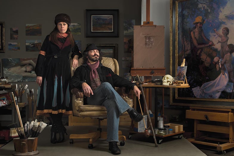
They shot the portrait above in the Carson, California, studio of Russian-born painter Alexey Steele, who posed with his wife, Olga. “The studio had an old-world quality to it,” Johnson remembers. “That dictated that our lights should, perhaps, seem to come from a window or even a nearby lantern—something directional with shape to it.”
The photographers decided that window light, the classically soft and enveloping illumination that many Old Master painters used for portraits and still lifes, would work for this scene. Their plan for replicating window light “starts with placing a softbox out of the frame wherever we feel the ‘window’ should be. Then we will often open up the shadows a bit by adding a fill light coming from the opposite direction of our ‘window,’” says Johnson. They might also move the key light forward toward and backward away from the subject until it most accurately recreates the soft, window light look.
Once the light seems right, Kremer recommends making a test shot and studying it. “You might want to add an accent light, maybe two, to create some separation between your foreground subject(s) and the background or to highlight something specific in the scene.” (See the diagram above for how Johnson and Kremer placed their main and accent lights.)
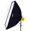
If the lighting isn’t working, experiment. “Try adjusting your reflectors a bit —sometimes a few inches can make a dramatic difference. Then play with the lighting ratios by making the main light brighter and the fill dimmer, or visa versa. You might also try different modifiers,” says Johnson. “Remove the outer diffusion panel of your softbox, for example, as we did for one of the lights here.” Work slowly and deliberately, and eventually you will achieve the window-light look.
“Always keep in mind that the overall goal is to make the lighting interesting without calling too much attention to itself,” advises Johnson.


TOOL TIPS

TOOL TIPS

TOOL TIPS