Adobe Photoshop Touch Brings Layers and Other Familiar Editing Tools to Tablets
A "real" Photoshop experience on a tablet gets a lot closer to reality

Adobe has not been shy when it comes to the idea of integrating the iPad into a real imaging work flow. The new Photoshop Touch app really hammers the whole thing home. It’s not quite the concept we saw earlier this year, but it’s getting there.
Announced today, Photoshop Touch works a lot like, well, the real Photoshop. Where the iPhone version made due simply with pre-set effects and a couple sliders, Photoshop Touch uses some of the same tools you’d expect to find in the full version of the software on your computer.
You navigate photos using the Gallery function, keeping images arranged in photo albums. It lets you pull from your device, from the device’s camera, or from the Web. The demonstration of the Google search is particularly interesting in that it lets you search using terms as well as colors and usage guidelines. So, if you want a picture of a red bike with a creative commons license, it can hunt it down.
Once the images is open, it comes into your current project. If you already have images on the canvas they’re placed on a new layer. Yes, that means that Photoshop Touch supports layers and from the demonstration, it seems to do it pretty well. Plus, if you save your image to Adobe’s Creative Cloud (which has engulfed the previously announced, Carousel) service once you’re done, you can open it in the full version of Photoshop complete with layers. You also have the option to send it right off to Facebook or other web services if you see fit.
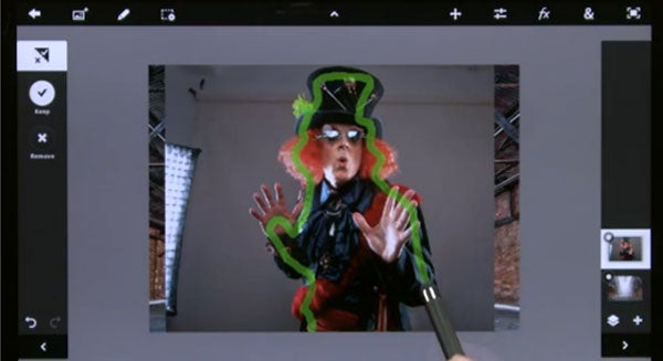
One of the more impressive demos is something called Scribble Selection, which lets you roughly define objects for extraction using your finger (or better yet, a stylus) before the software automatically sucks it out of the background. The results in the demo actually look very impressive, which helps ease at least a little bit of the qualms people have with the relative lack of accuracy capable with a touchscreen interface.
One downside is that images are capped at 1600 x 1600. they don’t offer an explanation for the cap, but it seems it might simply be about being able to work on such a big image on a small screen. Still it seems a little odd that you won’t be able to work on images that are big enough to fill a 1080p HD screen (typically 1920 x 1080).
What does all this mean for Adobe’s other “Photoshop Touch” apps? They’ll be sticking around, but the Photoshop Touch name will now be specific to this one piece of software. The Photoshop Touch SDK will now just be the Photoshop SDK, which is just another way for Adobe to imply that touch is no longer an add-on, but a new standard operating procedure.
We’re looking forward to getting hands-on with this thing and seeing what it really can do. The Android version is scheduled for November release, while iOS users will be waiting until early 2012 to, um, Touch Photoshop. Until then, feel free to argue in the comments about whether or not you think this will eventually make its way into your own workflow.
Click here for the official blog post announcement from Adobe
