First Impressions: Blurb’s Instagram Photo Books
A hands-on look at Blurb's new collaboration with iPhone photo-sharing behemoth, Instagram

We may earn revenue from the products available on this page and participate in affiliate programs. Learn more ›
Last week, the photo book service Blurb announced that they were officially integrating the iPhone photo-sharing giant Instagram into their service. I got a chance to check out the utility before it went live and the book hit my doorstep today.
During the building process, I went with all of the elements that Blurb had recommended. I went with the ImageWrap cover (no dust jacket) with ProLine uncoated paper and charcoal paper under the front and back covers.
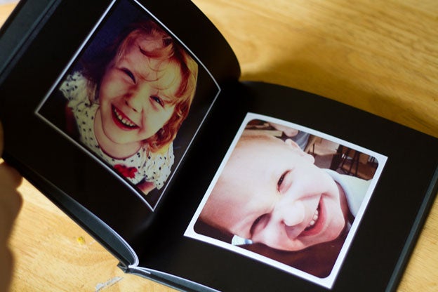
Like most of Blurb’s other books, the whole package is nicely put together. I picked black paper to add even more impact to the already contrast-laden Instagram images, but because it’s dark and uncoated, it tends to collect fingerprints rather easily. I’d likely go with something lighter next time for that reason alone.
The images themselves honestly look better than I expected, blown up as big as they are. The book itself is 7×7-inches and there’s about an inch of space surrounding each image on the page. From up close, the digital artifacts become apparent, but you have to be looking for it. Brighter images tend to show it less than darker ones.

My most frequently-used filters are the Lomo-fi, X-Pro II and Hefe, all of which are reproduced pretty faithfully in book form. The black and white examples aren’t quite as impressive, but that likely lies in the relative weakness of the black and white filters in the Instagram app. If I had to suggest a black and white filter, it would be Gotham because I think it’s high-contrast look is the best aesthetic fit with the rest of the filters.
Just to see how the Instagram stuff compares to images from other sources, I pulled a couple images from my Flickr account as well. Predictably, the Flickr stuff looks technically better than the Instagram images, but the filters certainly help even the aesthetic playing field. But, I guess that’s the point. Also, by adding a white border to the Flickr images, it helped them blend into the collection a lot better. Personally, it would feel kind of awkward to have an inconsistent mix of aspect ratios and overall print quality, but that might not bother you.
Ultimately, I like the final product quite a bit. The final cost was a little over $30, which is reasonable for what you get, but might be a little steep when you consider the lo-fi nature of the Instagram app. That said, you can go soft-cover and skip the fancy paper and get the price down as far as $14, which will probably be more appealing to the Instagram crowd.
You can check out my impressions of the book-making process over on the announcement post, or just sign up for Blurb and mess around with it yourself on their page.
