Behind the Scenes Video: Annie Leibovitz Shoots Caitlyn Jenner
This month's photo that will probably "break the internet"


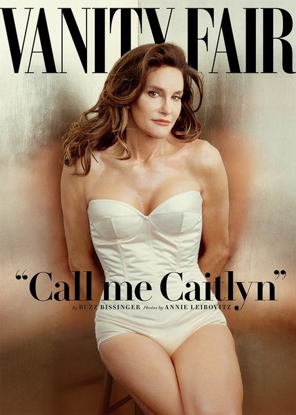
When it comes to super high-profile photo shoots, Annie Leibovitz is certainly no stranger. Now, her cover photo of Caitlyn Jenner for Vanity Fair is poised to be one of the most notable magazine covers of the year.
Caitlyn was once known as Bruce Jenner, but has now made the transition to Caitlyn. Thanks in part to its connection to the Kardashian publicity carnival, the photo has generated absurd levels of hype and strong reactions from supporters and detractors.
I actually really like the portrait itself. It seems like a relatively straight forward lighting scenario with a very basic, but interesting background. The light is diffused enough to be flattering (and not create harsh highlights on the shiny backgrounds), but it’s directional enough to give that cream-colored outfit some texture and detail. Looks like the key is coming from an octobox with some added diffusion.
The pose is an interesting one, in that it’s rather classic in the head position and the body angle, but the hands are behind the back. The amount of texture left in the skin suggests there isn’t as much retouching as one would expect for a shoot like this. That might also explain why the hands are hidden, because they have a tendency to show age, or possibly take away from the perceived “femininity” of the overall photo.
What do you think of the image? Would you have done something different?
[EDITOR’S NOTE: Hateful or ignorant comments will be deleted. Don’t bring that around here.]
