Interview: Mitch Feinberg On His Boston Magazine Marathon Tribute Cover
When the Boston Marathon was attacked last month, the staff at Boston Magazine_ wanted to do something special to honor...


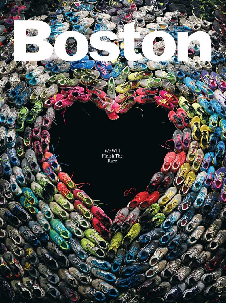
When the Boston Marathon was attacked last month, the staff at Boston Magazine_ wanted to do something special to honor the victims and pay tribute to a city that had been thrown into chaos. They settled on the idea of collecting sneakers from runners in the race and telling their stories. All the sneakers would be collected into a single photograph and put on the cover of the magazine. They hired veteran still life photographer Mitch Feinberg to get the shot. This is the story behind that shot. _
In the aftermath of the attacks, the magazine had to hustle to make changes. How much notice did you have?
I received a call from the design director two days before we had to shoot it. He explained the story and I was already booked, but I said, “we’ll figure it out. Get the sneakers together and come on down.”
They drove the sneakers down to New York because I had been shooting that day and that’s where all of my equipment was. I couldn’t really move. With all the traffic problems and the president set to arrive any time, it didn’t make sense to shoot it up there.
The magazine used social media and other channels to collect sneakers from the race. How many pairs did you end up with?
We were lucky enough to get about 120 pairs. We were very concerned about getting enough in time. We knew we would get a lot, but we had to be done with the picture by Thursday evening, so even if more sneakers arrived on Friday, it would have been too late.
Did you ultimately have enough?
We didn’t have quite enough sneakers to fill the top corners. We basically calculated a square foot for every three sneakers, but it’s hard to calculate the area of a big heart. We shot one frame, then we pulled some from the bottom and filled in the top corners, shot another frame and that was it. I didn’t want to go and buy any because each pair represented someone’s story. I didn’t want to leave the corners empty, because I think that doesn’t give the right message. Normally I don’t retouch or composite, but the only bad picture is the one that you couldn’t make. So some people got their sneakers in twice.
How did you ultimately decide which sneakers went where?
I talked with my stylist (set designer Megan Caponetto) about it at length. One of the things we were concerned about was that we didn’t want it to start to look like the Holocaust memorial in Washington. It’s a big pile of sneakers. Nor did we want something too maudlin or tear-jerky. We thought we would make a rainbow out of them and make it very structured so that there would be a definite design intention. It wasn’t going to look like a found photograph. A lot of care went into that and figuring out a way to tile them so they have the most impact. We were very careful to leave laces to give it a little spontaneity

Boston Magazine Mitch Feinberg Cover Back
The back cover of the magazine is the same layout, but with the soles of the shoes facing up. Was that part of the original plan?
While we were shooting, I said to myself, “You know, it would be really cool to shoot the soles.” So, once we were done with the first picture, we flipped all the sneakers over and did a second shot. Then we called the editor-in-chief and said “Do you have an ad for the back page?” And they did have a sponsor, but the editor so loved this idea that they decided to rearrange things so they could have the front and back cover be consistent. I have a lot of respect for a magazine that’s willing to do that.
What did the final setup look like in the studio?
I usually shoot 8 x10 film, but because the picture needed to be sent out that night, I shot it digitally using a Phase One 180 IQ back. I shot it on this very special black velvet I have, which is like a Swiffer for light. It absorbs everything. I was all the way up on the ceiling close to five-meters high.
How about the lighting?
It’s a 12 x 12 silk on a frame. It’s at about a 40-degree angle going almost all the way up to the camera, which was not quite centered. Behind the silk were somewhere between seven and nine lights. Some were pointed at the bottom on much lower power and some were pointed at the top at higher power. No fill on the other side. Everything else dropped to black. That way I was able to get some light fall off in the corners, but not so much that it becomes heavy.
There’s a pair of Vibram toe sneakers at the point of the heart. What was the intention of their placement?
I specifically put those there because they were red and they looked like feet and they made themselves visually important. They make it real—human. It points directly down to where it says “We will finish the race.”
A few internet detractors have complained because they thought the assignment should’ve been given to a Boston photographer. Have you seen any of those comments?
I have and I haven’t really responded directly to them yet. Here you have this dark cloud—a terrible event, and there’s a magazine that’s going to print in three days. I saw that we could do this thing and try to make it a symbol of a resilient city. When you have a moment of stress in a community, most people come together and contribute. Whether it’s people who were at the scene and were running to help or the people who sent in their sneakers—even the people working at the magazine. The photo is about the people who belong to those sneakers. It doesn’t matter who made the photograph, it’s about making the best possible photograph in those circumstances.
Are you at all surprised at the national reaction the photo has gotten?
I can’t believe how much press this is getting. For a still-life photographer, almost every photograph we make can be replicated in some way. Whether it’s shoes or perfume, whatever. To have an opportunity to shoot something that’s part of a single moment, and create a unique image, that’s an unusual thing. I was very honored that they asked me to work on it.
Many still-life photographers are very meticulous in their pre-planning. Was it difficult for you to put together this shoot in such short order?
I’m very used to working at the last minute. I don’t like things to be too set in advance. I like happy art accidents and having pressure. For advertising, it’s a different thing, but for editorial, I like to have a rough idea. But I generally don’t sketch things out—I usually make my image on-set. I just go with how I’m feeling at that moment. I like photographs that are about adjectives and verbs, not just about stuff.
