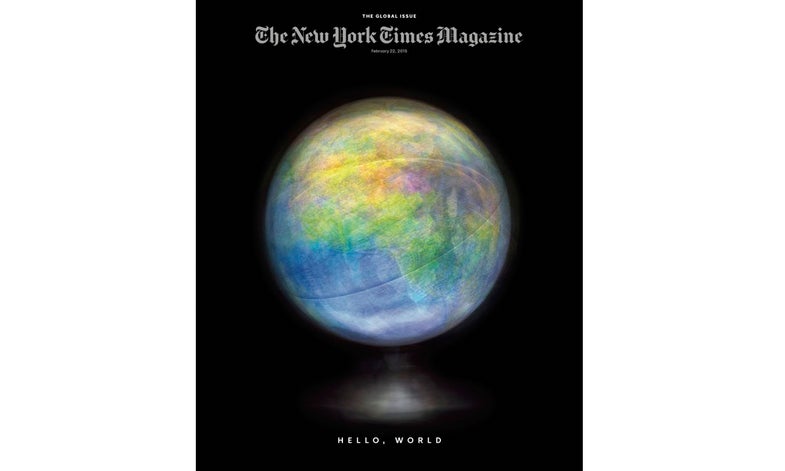
How Matthew Pillsbury Shot His New York Times Magazine Relaunch Cover
A master shares his secrets


The 119-year-old New York Times Magazine redesigned and relaunched this past weekend with four dynamic covers to their “Global” themed issue. Their team commissioned illustrations from photographers Matthew Pillsbury, Hannah Whitaker, Sara Cwynar, and the duo Maurizio Cattelan and Pierpaolo Ferrari “based on the idea of chaos in the world, and how this is something we have all learned to live with,” says design director Gail Bichler. For Pillsbury, known by his large-format long-exposures of crowded public spaces, shooting an inanimate object in a studio-like environment was a first. We asked him exactly how he made the chosen photo which conveys “the speed at which our world is changing.”
The image was shot in my basement on a black table using a Phase One IQ260. I ran long exposures and would spin the globe/globes in front of the camera using only their own light (they were all old school lit globes). I did over 300 exposures which for me is an incredibly large amount. By comparison when I used to shoot with the 8×10 I would only take a dozen at the very most. For the image that was selected, I used three different globes so that it was not only the spinning/stopping that was captured but an actual overlay of different maps. It very much felt like low budget sci-fi movie making where the behind the scenes looked totally ridiculous but the finished effect was quite surprising. The process was similar to my usual methods in that I used only the available light and how the camera captures movement over a long exposure but it felt quite different since I was shooting a single object without any people in the frame in what approximated a studio environment which is something I have never done.